About the Project
Website development for medical institutions is one of our areas of activity. We have created from scratch more than 10 similar projects of varying levels of difficulty. At the time of contacting us, Laurus Dent plus clinic had been working on the dental services market for several years.
The main task was to create a website that provides potential clients with information about the services and activities of dentistry and attracts new visitors. The website should be easy to use, memorable, create positive emotions and trust in dentistry.
-
 Our Goals
- To create a website for a dental clinic with the corporate colours of the customer.
- To implement a responsive layout for the correct display of the website on different devices.
- To organize a convenient interaction with website visitors through feedback.
- To optimize the website for search engines, improve the position in the Google.lv search results
-
 What have we achieved
- Designed the easy-to-use structure of the home and all internal pages of the website.
- Developed an individual design in accordance with the customer's requirements. We have developed a responsive website: it is displayed correctly on any device, from a desktop computer to a smartphone. All of this has greatly improved the conversion rate of mobile users and makes the website more suitable for search engines.
- Programmed a website on an easy-to-use CMS MODX Revolution.
- Collected the semantic core of queries and optimized the website for search engines.
- Created optimized content for sections of the website. Emphasized the painlessness of the treatment.
-
 Result
We have developed for the client a running optimized website with an individual design and a user-friendly structure. The website of the Laurus Dent plus dental clinic is fully consistent with the goals set and is an effective tool for interaction and communication between the clinic and its patients.
IMPLEMENTATION OF GOALS
Data Collection and Prototyping
An important feature of this project was that the customer was minimally involved in the process of discussing the structure of the website and its sections.
Our many years of experience in the development of medical websites allowed us to develop the correct, user-friendly website structure and navigation.
The prototype of the website was accepted by the customer on the first try without any edits or comments.

Design
It only takes the user 30 seconds to form a positive or negative attitude towards the website, depending on the appearance of the website.
Our designer used a calm and light colour palette in the design of the clinic's website. We used the customer's corporate orange colour, white, light grey, and grey colours. We focused on the most convenient and user-friendly interface.

Features of Implementation

Description of Services
Each service section has its own SEO text, and the services are presented in the form of a list with explanatory text.
We have provided the ability to link additional blocks to services: Photo Gallery, Frequently Asked Questions, Service Prices, Appointment button to increase conversion.
Specialists
The website provides comprehensive information about each specialist of the clinic: work experience, education, professional skills.


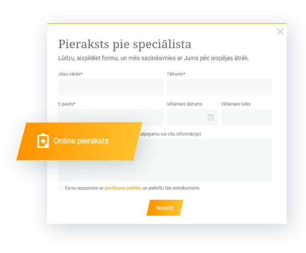
Appointment 24/7
There are several ways to make an appointment:
- through the website menu, which is always visible at-a-glance - for quick access;
- on the page of a specific service;
- through the Call-to-Action block, which can be placed on any page of the website;
- in the Contacts section.
